My Pastor Once Said
Aug 9, 2026 · 9min
A campaign for the lines that stuck. What I designed, what broke, what the numbers said, and where it landed.
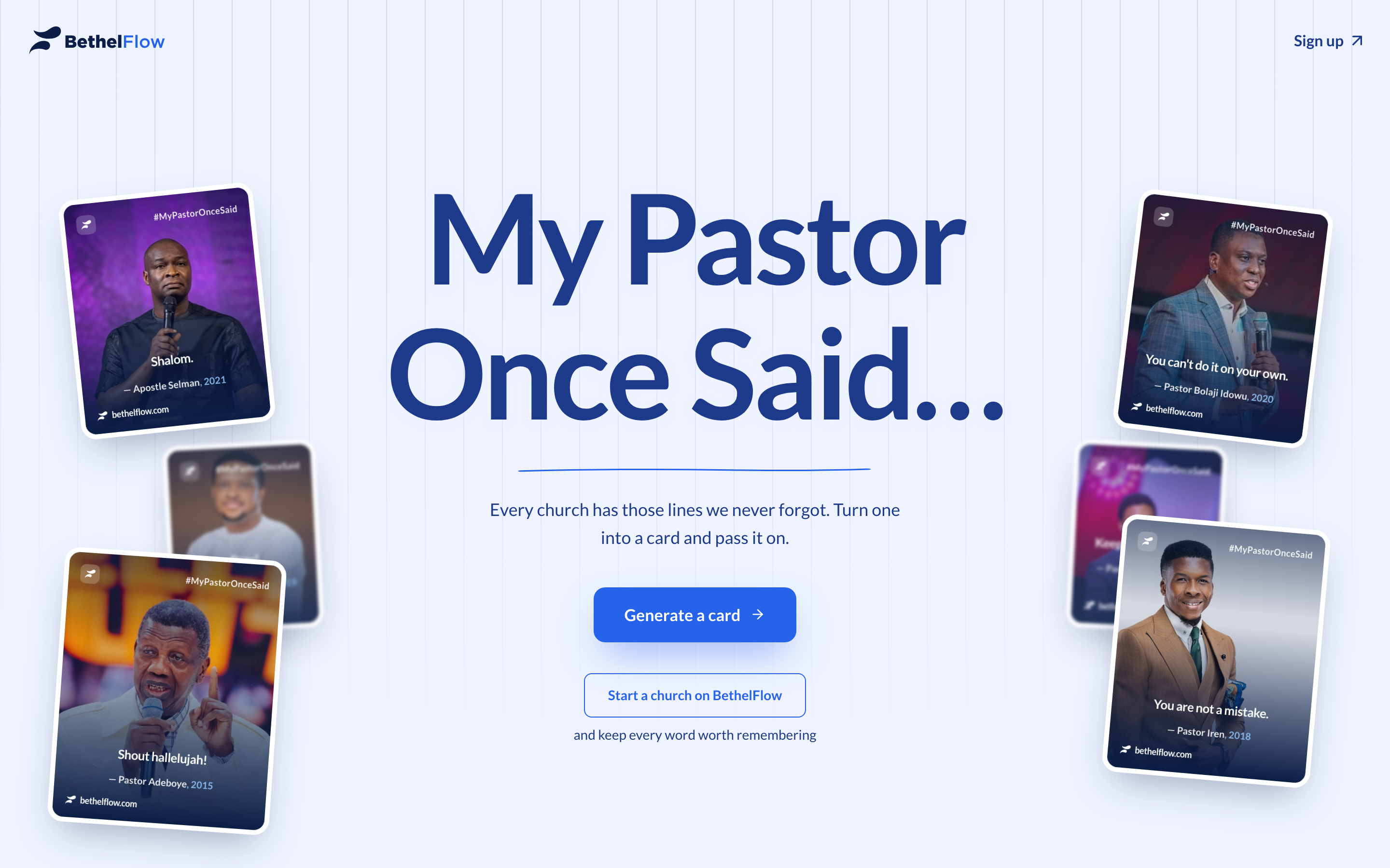
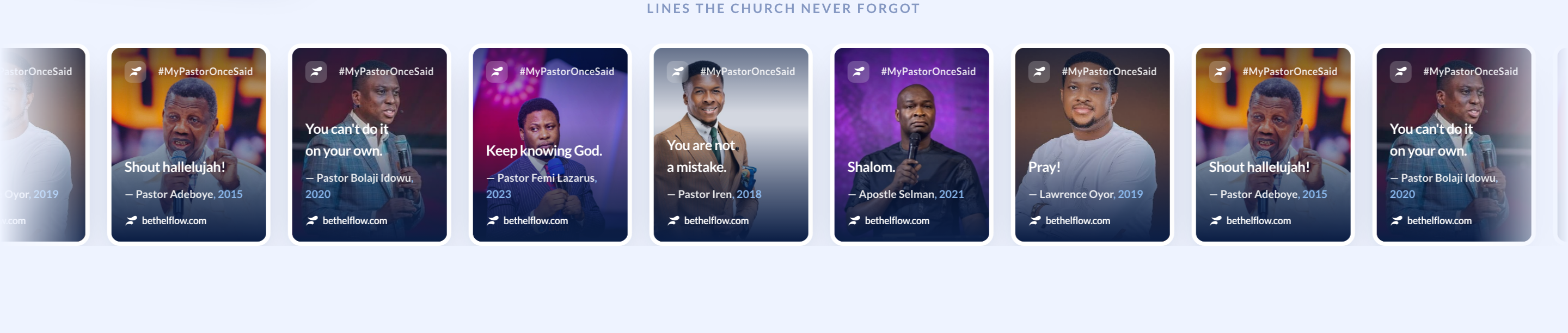
Every church has a few lines it never forgot. The one your pastor said at the end of every service. The sentence you were half-listening to at seventeen that you're still carrying at twenty-seven. Shalom. You are not a mistake. Shout hallelujah. You know the ones.
We wanted to collect them. Not in a database, but on people's phones, in group chats, on statuses. So we built My Pastor Once Said for BethelFlow: type a line your pastor never stopped saying, add a photo, and walk out with a card built to pass on. This is the story of designing it. The idea, my part in it, the rough edges, and where it is now.
Borrowing a good idea
The seed was Cowrywise's Mother's Day page, "Mama once said…", a small, joyful thing that turned a feeling everyone already had into something you could make and send in under a minute. We wanted that shape, pointed at the people who shaped our faith.
The strategy underneath it is plain. The movement is the hook, and "start a church on BethelFlow" is the quiet conversion sitting under it. Top of funnel dressed as a keepsake. That framing mattered, because it set the bar for the whole thing: it had to be the kind of page a person shares for their own reasons, not because we asked.
My part was the experience. Make it fast to pick up, cheap to run, and good enough that sharing it never feels like an ad.
Designing for a five-second pickup
The rule I set myself: a stranger should understand what this is and start making one before they've decided whether to. That meant the payoff couldn't live at the end of a form. It had to be right there while you typed.
So the create flow is a small wizard, the line, then the photo, then the card, with a live preview sitting next to the form the whole time. Cowrywise reveals the card after you finish. We diverged and let you watch it assemble as you go. You type a name, it appears on the card. You paste the quote, the card breathes. The work and the reward share a screen.
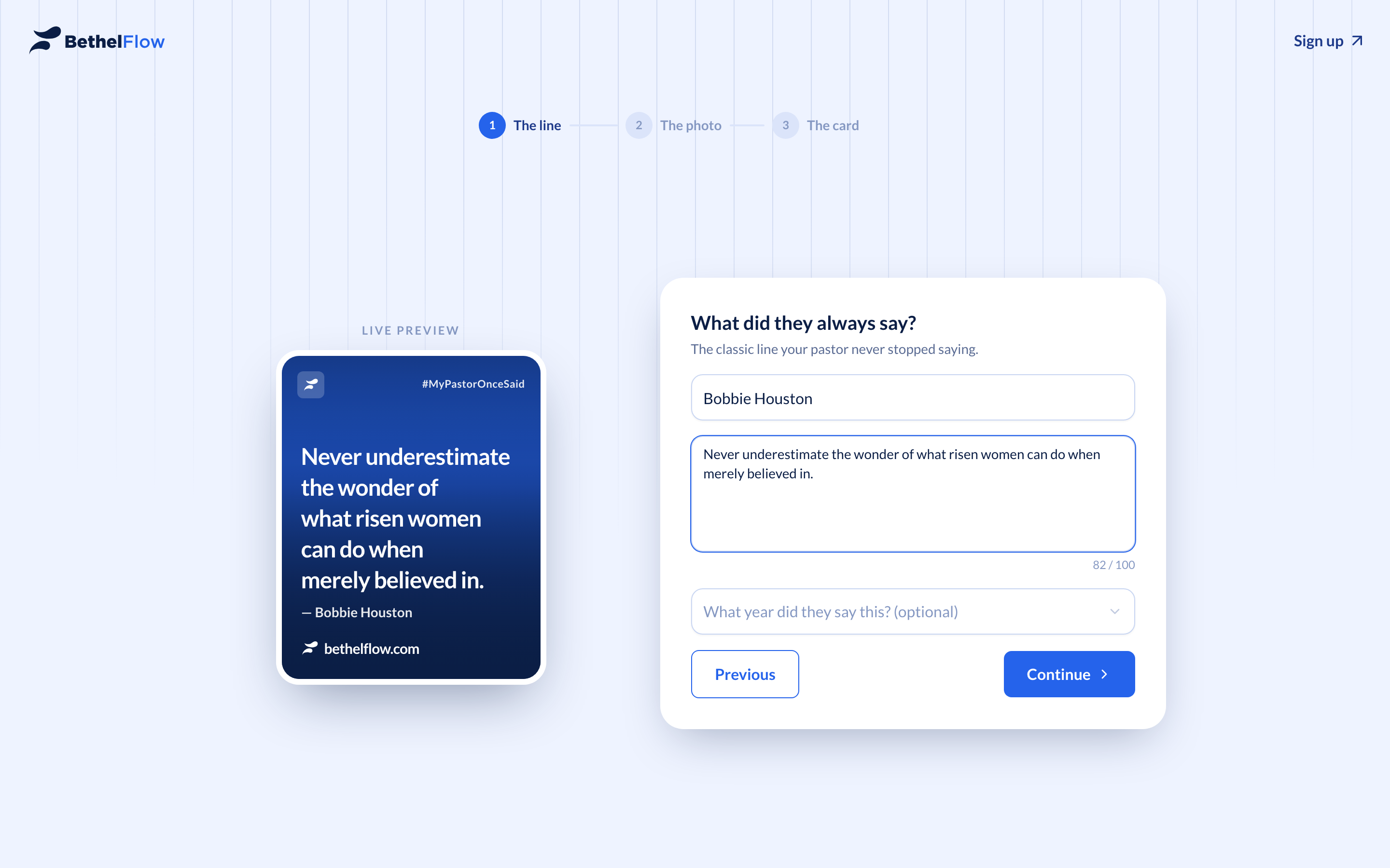
The whole thing wears BethelFlow's blue with a single gold accent for the campaign. Close enough to the brand that it reads as them, distinct enough that it reads as an occasion. No purple, no sub-brand. Just BethelFlow in a good mood.
The photo never leaves your browser
Here's the decision I'm still happy about. Early on, I didn't want to store anyone's uploads. Partly cost, mostly trust. Asking someone to hand you a photo of their pastor on day one is a big ask, and "where does this go?" is a fair question.
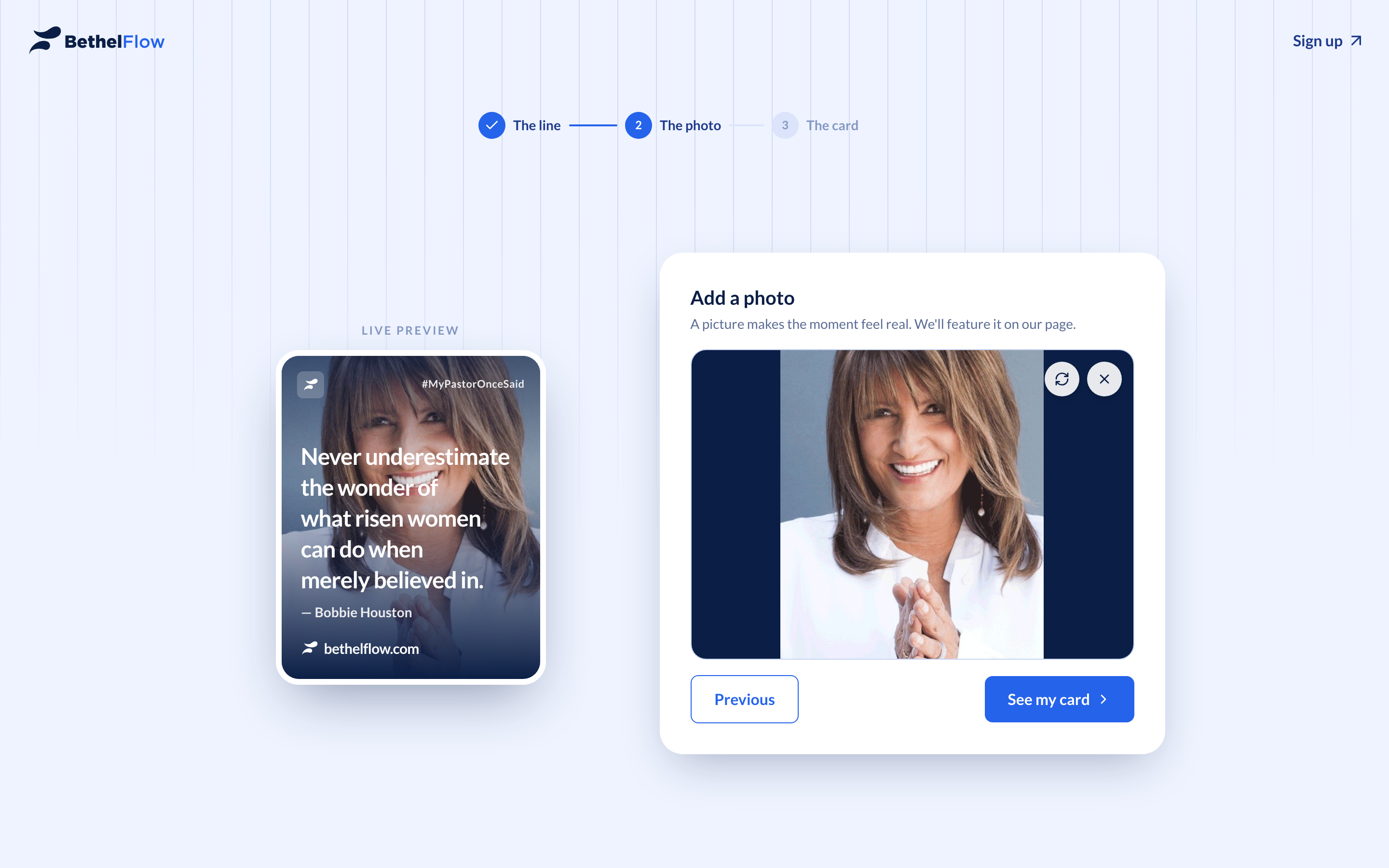
So at first, nothing went anywhere. The draft, your words and your photo, lived in the browser's own IndexedDB, survived a reload, and rendered the card locally. Download straight from the page. "We're not storing your images" wasn't marketing. It was just literally where the code stood. The photo genuinely never left the device.
That worked beautifully right up until people wanted to do the one thing the whole campaign was about: send it to someone.
The URL is not a database
A couple of friends,  codiejay and
  Tolu-Mals, are the reason this part of the story exists at all. They made their cards and immediately hit the wall the whole campaign was pointed at: they wanted to send them, and sharing wasn't really there yet. Their nudging is what turned "download and keep" into "share and pass on," and, a few detours later, what put photos on Vercel Blob.
Because sharing breaks the no-storage stance. A shared link needs two things I didn't have: a page that lives at a URL, and an image a link preview can actually show. My first instinct was to cling to the principle and smuggle the entire card into the link, encoding the name, quote, and year as a blob of base64 in the path, so the URL itself carried the card and I still stored nothing.
Two walls, fast. A phone photo is two to five megabytes; it cannot live in a URL, full stop, no matter how you encode it. And even the text-only version produced links about three hundred and twenty characters long, the kind of link that looks less like a keepsake and more like something a stranger DMs you before stealing your bank details.
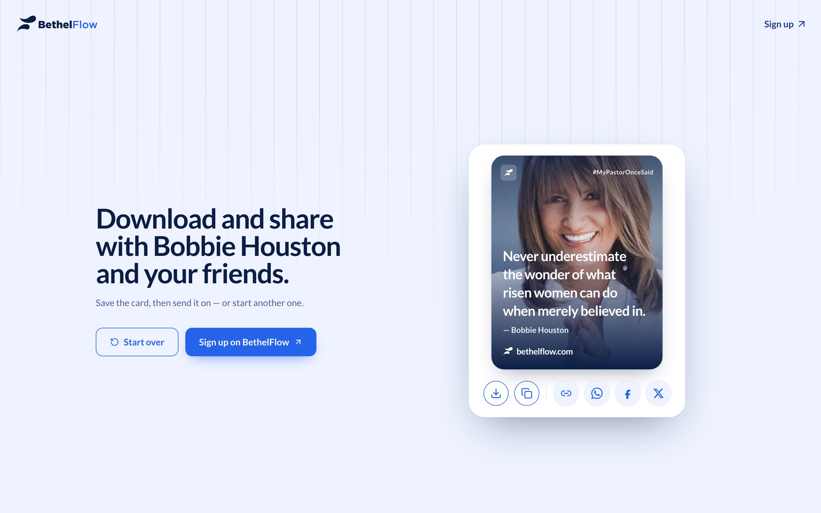
I gave up gracefully. Photos moved to Vercel Blob, but on my terms: the upload only fires when you actually reach for share, it's deduped by a hash of the file so refreshing never piles up copies, and a weekly job sweeps anything older than ninety days. The promise softened honestly, we don't store it until you choose to send it, instead of breaking. And in return we got real shareable pages, copy-to-clipboard, and link previews with the actual card in them.
The preview that rendered nothing
The links worked. The previews didn't. A shared card came up blank where the image should be. I went hunting in the usual places first: the upload, the cache, my own markup. It took a while before it clicked that the culprit wasn't the card at all. It was satori.
The link-preview image is generated with next/og, which is satori under the hood. My card had a scrim, the dark gradient that keeps white text legible over a bright photo, and I'd written it the way you write it in a browser: pinned to all four edges, no explicit size. Every browser understands that. Satori doesn't. It sized the scrim to zero by zero, painted nothing, and on any light-coloured photo the white quote simply dissolved into the background.
The fix was one of those humbling one-liners: give the overlay real dimensions. The renderer that isn't a browser needs to be told the things a browser would have inferred. Scrim painted, text back, previews readable.
Shorter, prettier links
The base64 links still bothered me. A keepsake shouldn't look like a ransom note. So the payload came out of the URL entirely. Each shared card became a tiny record with a random eight-character id, and the link just points at that. Roughly three hundred and twenty characters down to about fifty.
The part I cared about was not breaking anyone who'd already shared. The resolver just looks at the length and picks a path. A short id gets looked up, an old long token still decodes inline like before.
return param.length <= 16 ? loadShareCard(param) : decodeCard(param)
Nobody's link died. Old and new both resolve to the same card. Migrations you can skip are the best kind.
The first day, and the dip
Launch day did better than I'd let myself hope. In a single day the page took 168 views from 117 different people, and over the run it made 72 cards from 42 of them. For a side campaign built around a feeling, that's a lot of people choosing to make something.
And then, as campaigns do, it breathed out. The day after launch it was 56 views, then 18 the day after, then single digits. A steady exhale over the week.
Some of that taper is just gravity. But some of it I did to myself. Midweek I shipped a security-headers change, closed my laptop, and went to bed pleased. The new Content-Security-Policy quietly broke image downloading for everyone: the browser refused to fetch an image the app had literally just made. PostHog is how I found out. 42 failed shares, almost all of them from a handful of people tapping a dead button over and over, exactly the way you jab an elevator button that isn't wired to anything.
That bug got its own post, because it deserved one. The button that did nothing is the full autopsy. The short version: I'd been building on the one device where everything worked, and instrumenting failure so faintly that only luck told me it was happening.
Most of them were on a phone
The same dashboard said something quieter and more important than any single bug. Most people arrived on a phone, and on a phone they finished at less than half the rate they did on a desktop. I had lovingly designed a three-step, side-by-side wizard for a screen most of my users weren't holding.
So the create flow got rebuilt for a thumb. The separate line and photo steps merged into one compose screen with the card preview pinned to the top, so the payoff is always in frame instead of two taps away. "Take a photo" wires straight to the camera. Desktop keeps its roomy stepped wizard. The layout branches on the viewport rather than pretending one shape fits both.
The rest was performance, because a beautiful page that stutters on a mid-range Android is not a beautiful page. The marquee, that scrolling wall of example cards, got a lighter animation that pauses on hover and stands still for anyone who's asked for reduced motion. The decorative images lazy-load so they stop fighting the first paint. And the card-capture engine changed under the hood after WebKit kept dropping the photo out of exports.
One card, two themes
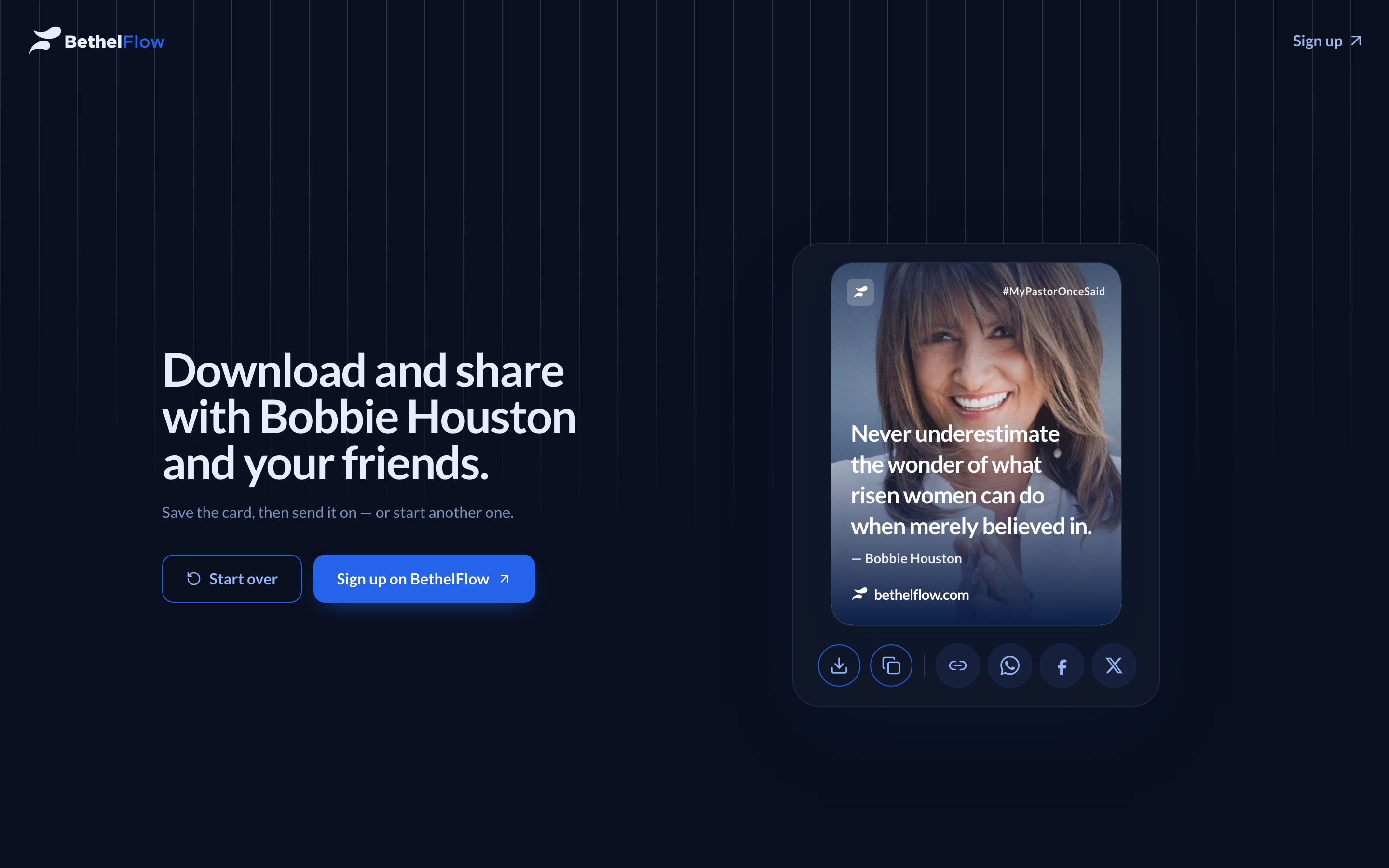
A small thing I'm fond of: the card and the whole page render in light and dark off the same live preview, so it looks intentional whichever way your phone is set. Same card, same words, different room.
Where it landed
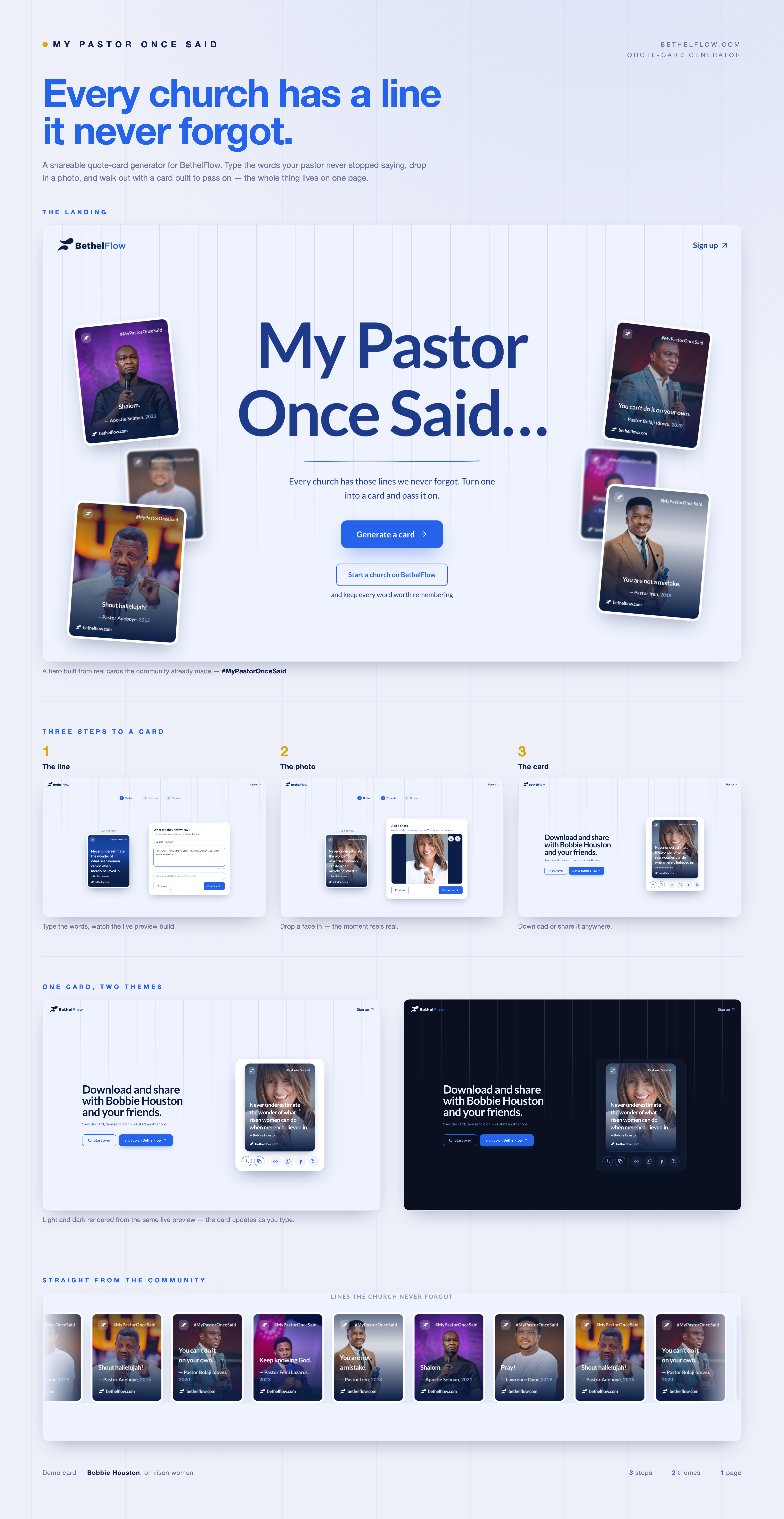
Here's the whole shape of it, start to finish.
Looking back, the thread through every good decision was the same. I kept holding a principle, and users kept, gently, asking me to bend it. Don't store the photo met let me send this to my sister. Keep it pure in the URL met a phone photo is five megabytes. Ship the elegant wizard met I'm on a bus, on a phone, using one thumb. The design got better every time I let the principle bend without letting it break: storing photos only at the moment of sharing, shortening links without stranding old ones, rebuilding the flow for the device people actually held.
It's evergreen, and it's still up. If your pastor had a line you never forgot, the one you can still hear in their voice, go make a card. Send it to someone who needs it today. We'd genuinely love to see the ones that stuck with you.